The IBM Poster Program: Visual Memoranda
AUBURN, AL
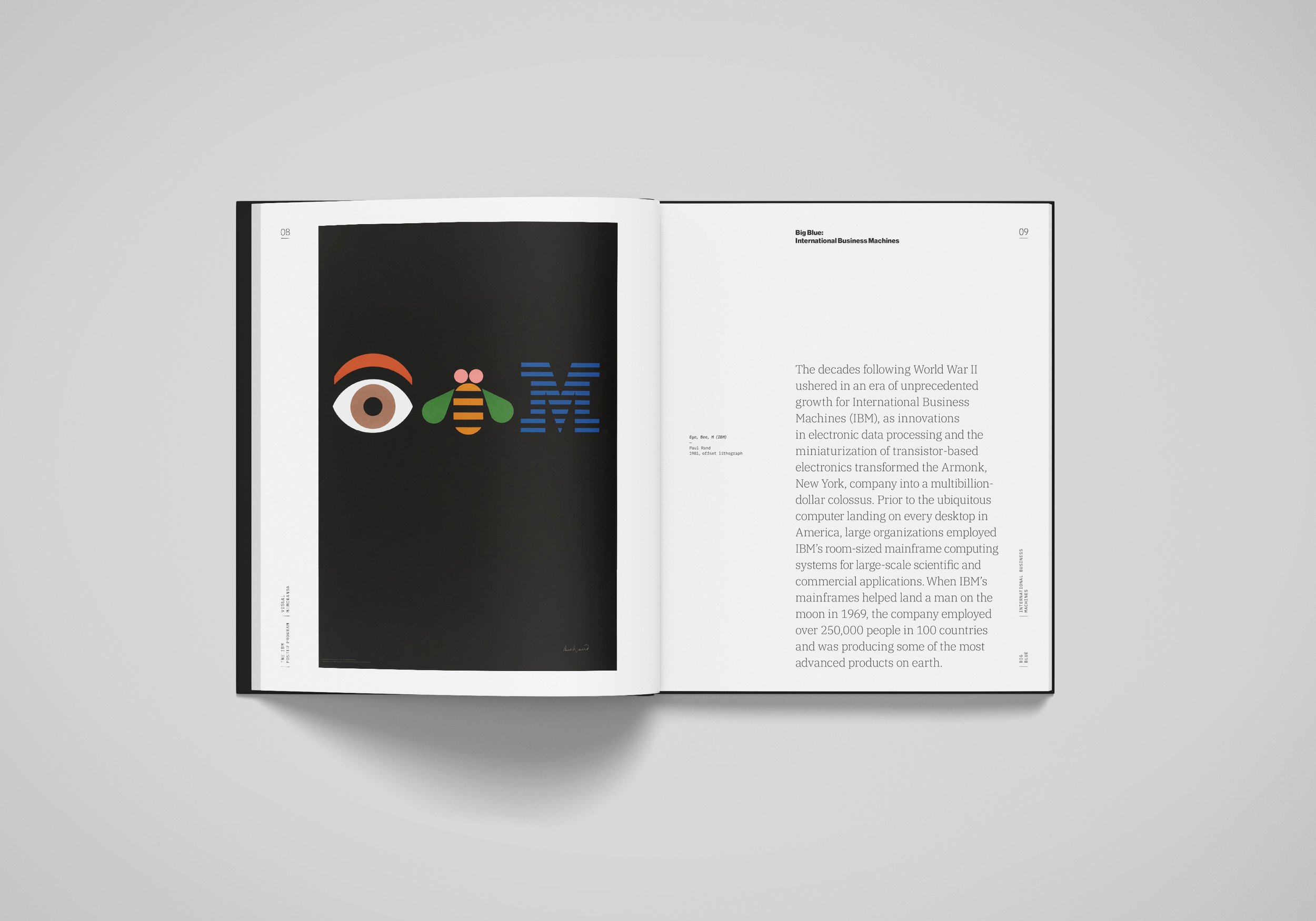
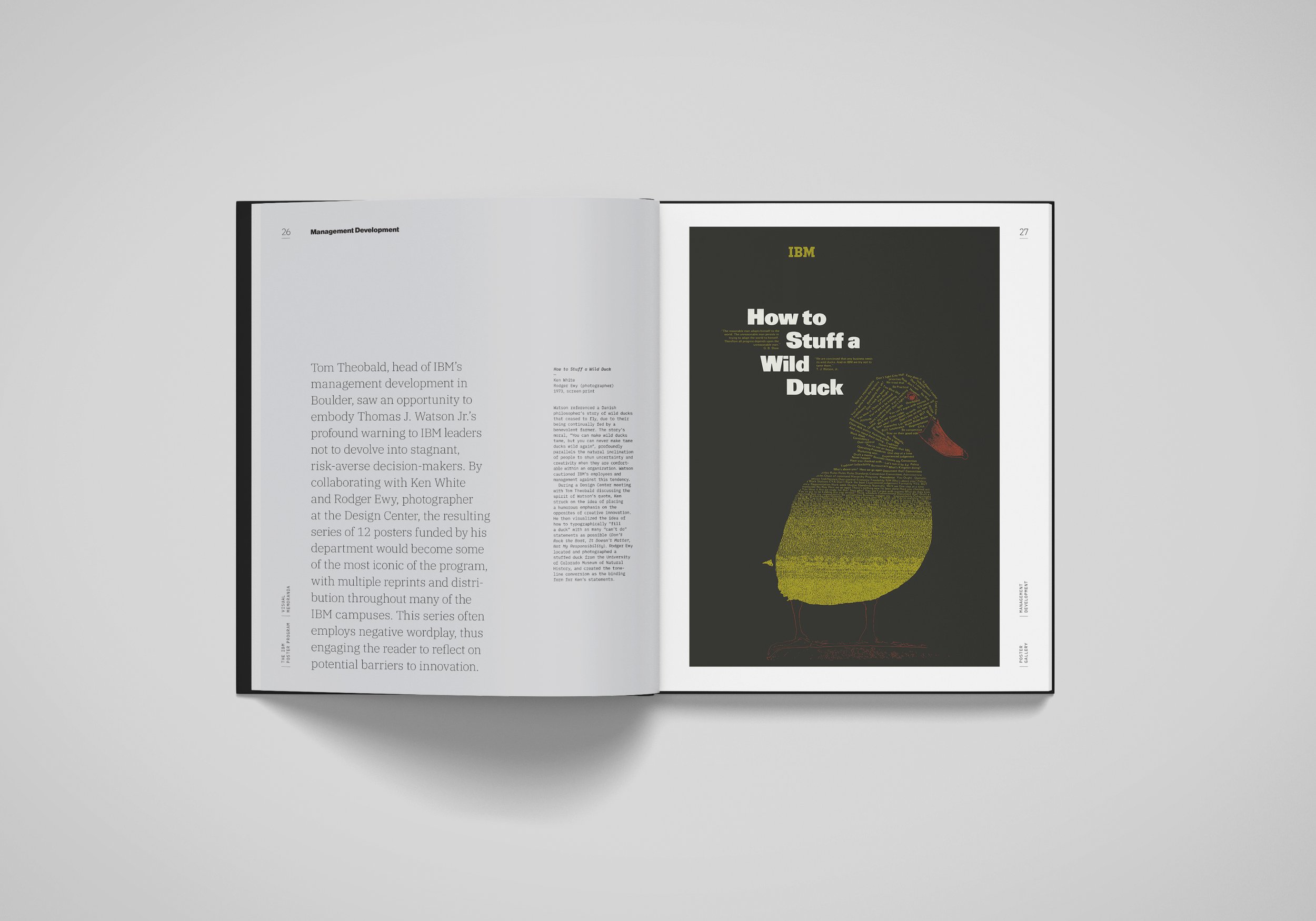
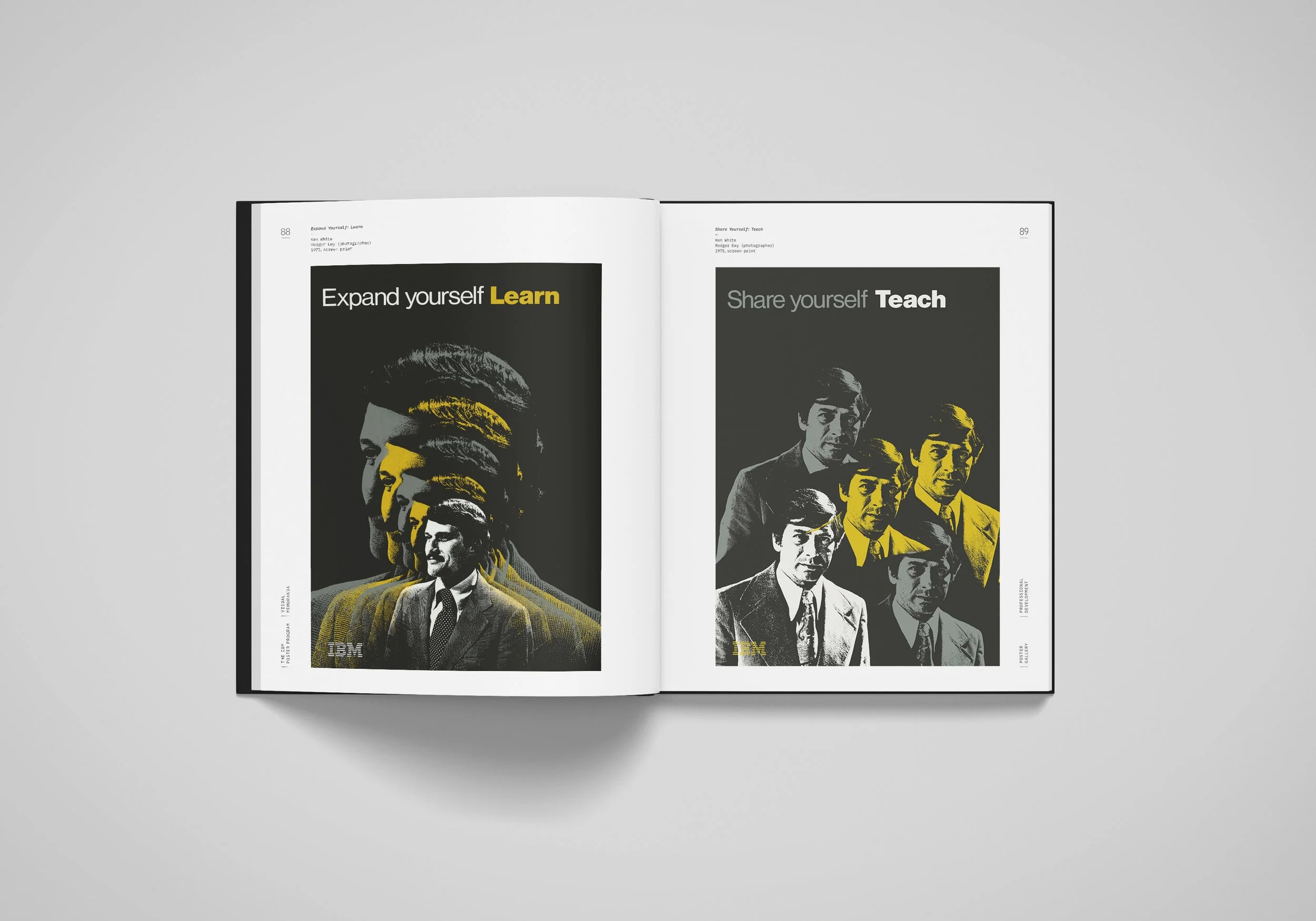
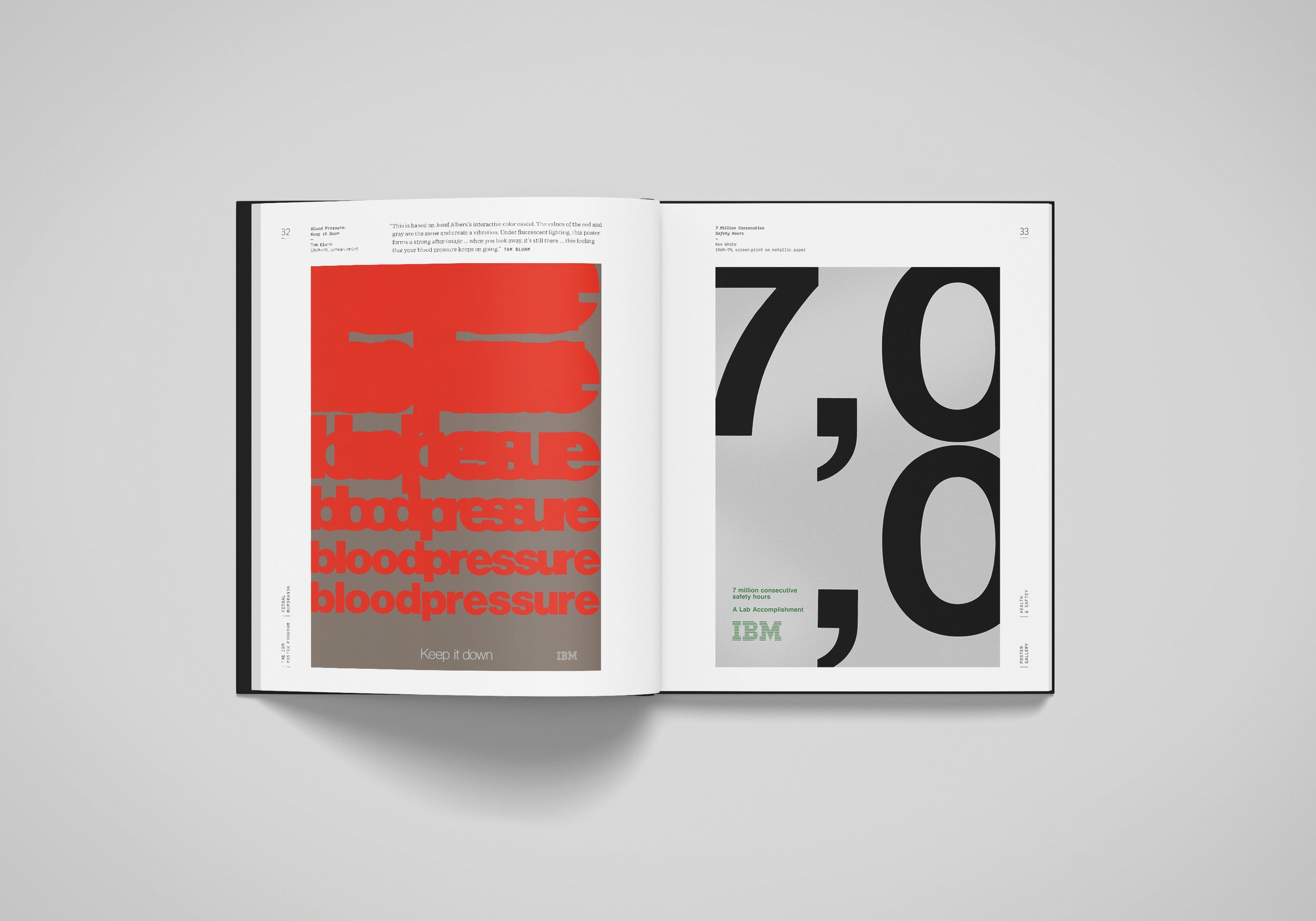
This book documents an in-house poster program that was developed by IBM staff graphic designers in the Boulder, CO Design Center as a platform for elevating internal communications and initiatives within the company during 1960s–1980s.
Collaborator
Shea Tillman, co-author
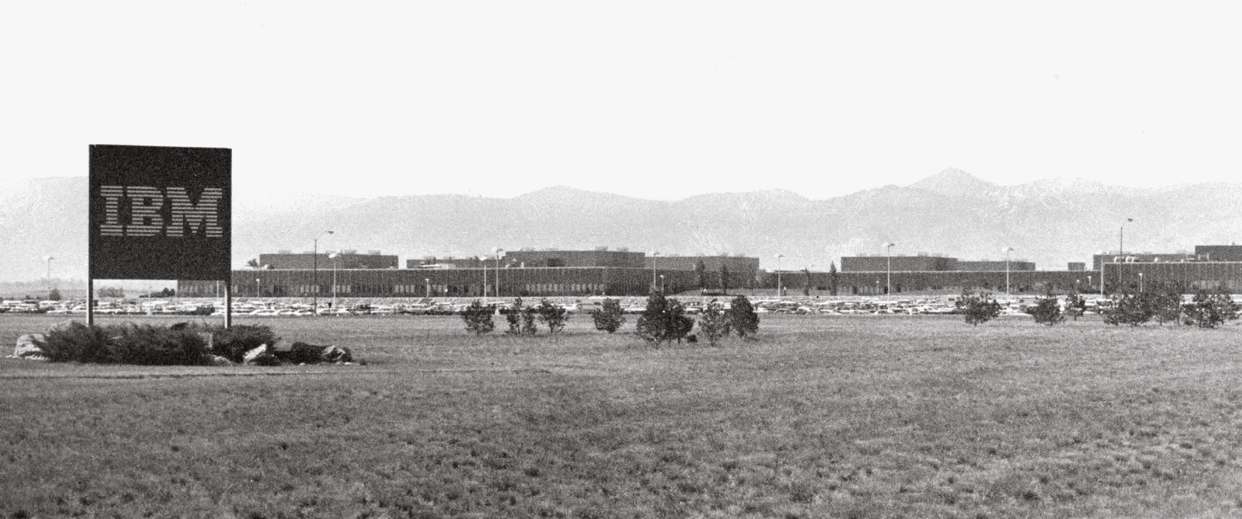
During the mid-twentieth century, perhaps no other American company exemplified technological achievement, business acumen, and good design better than IBM. Major advancements in data processing and mainframe computing brought forth an unprecedented investment in R&D within the company that provided a space for design to flourish. External consultant and director of design Eliot Noyes convinced IBM president Thomas J. Watson Jr. of the value that design could bring to the organization. He connected IBM leadership with famed designers such as Paul Rand, Charles and Ray Eames, and others. In addition, Noyes initiated the company’s launching of a dozen Design Centers across the United States, each of which complimented a manufacturing facility’s needs for industrial design and model-making as well as graphic design and photography.
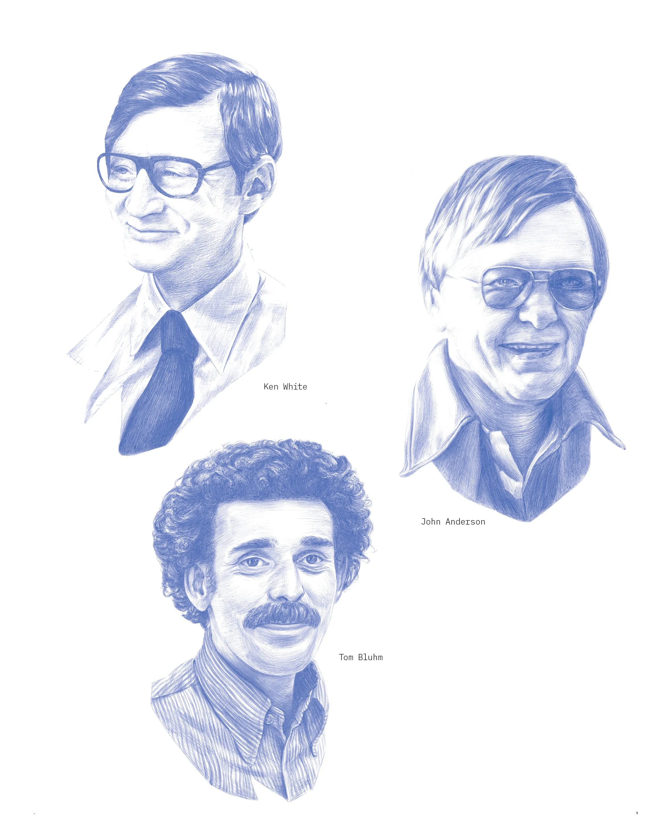
Illustration by Greer Miceli
Influenced by Paul Rand’s creative direction over IBM’s corporate identity, staff graphic designers Ken White — who had studied under Rand at Yale University— John Anderson, Tom Bluhm, and photographer Rodger Ewy developed posters as a platform for elevating internal communications and initiatives within the company. While daily tasks for corporate graphic designers often included layout work on newsletters, binders, symbols, booklets, and brochures, the visually clear, single-message format of the poster offered a unique creative outlet and latitude for experimentation.
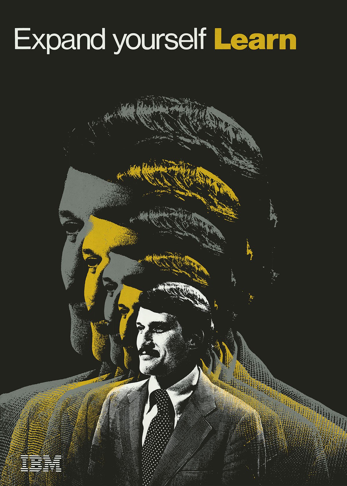
Throughout the book individual posters have been grouped according to two major categories: Themes and Series. Themes include general reminders related to subject matter such as Health & Safety, Security, or Productivity. Whereas series are typically unified by a distinctive visual identity. Posters are arranged on the pages according to their formal similarities and when possible anecdotes about specific posters from Bluhm and Ewy are included.
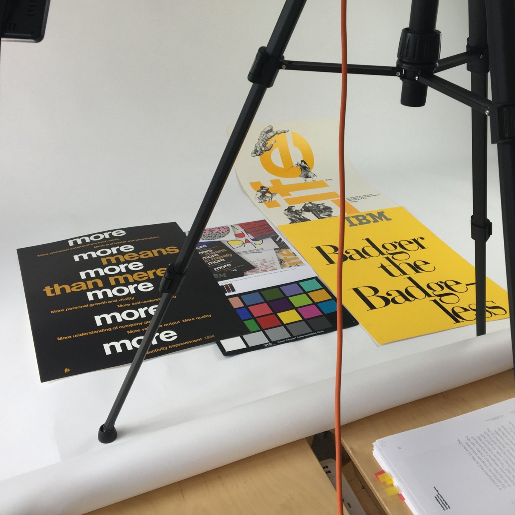
Each poster was designed within a Root 2 (15 × 21 in) format, and painstakingly produced, using screen printing by a small printshop operated by Fred Jurado, or offset lithography by Frederic Printing — both in Denver, Colorado.
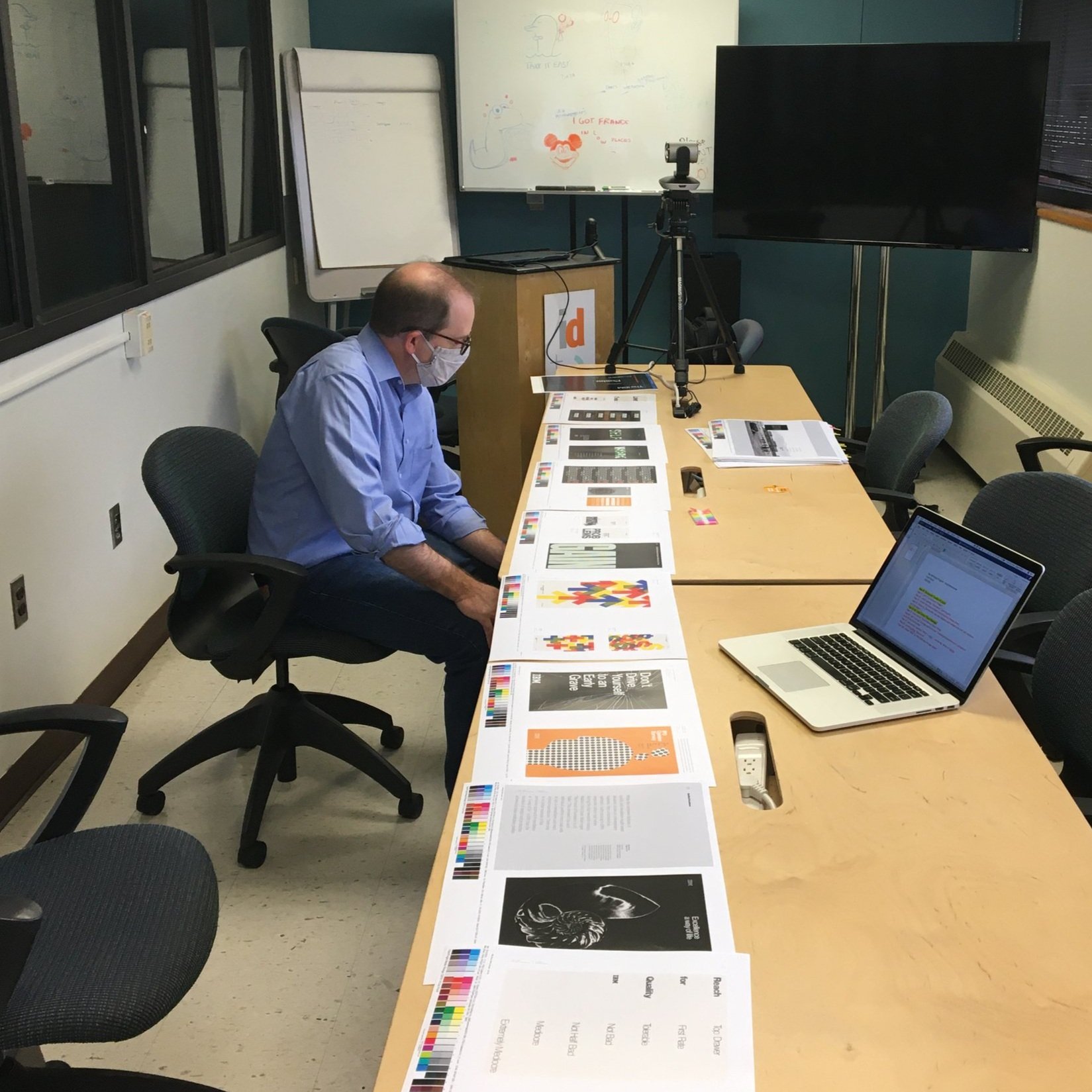
The original posters were carefully scanned by Shea Tillman and faithfully reproduced within the limited color gamut of traditional offset printing.
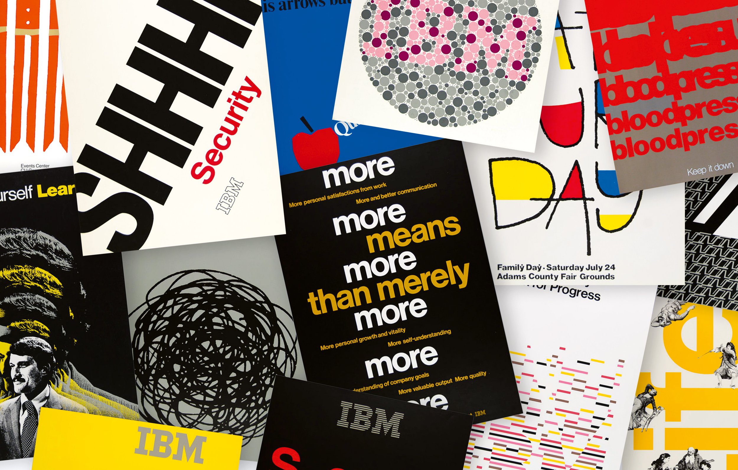
It is estimated that in the 15 years that the IBM poster program was active in the Boulder Design Center, over 500 posters were designed and produced by the staff. The sheer volume of this high-level design work, coupled with the uncompromising print craft is nothing short of astounding. These examples are limited to the work of White, Anderson, and Bluhm, due to their roles as primary staff graphic designers and their inspirational leadership to others. Their innovative posters stand as exemplars of mid 20th century corporate design.
Selected Press
IBM Beyond Rand, Steven Heller, PRINT Magazine
“… a collection created under the spiritual auspices of Paul Rand and Elliot Noyes.”
The IBM Poster Program. Design Observer.
It is estimated that in the 15 years that the IBM poster program was active in the Boulder Design Center, over 500 posters were designed and produced by the staff. The sheer volume of this high-level design work, coupled with the uncompromising print craft is nothing short of astounding. This book displays over 100 of these innovative posters that stand as an exemplar of mid 20th century corporate design.
The Radical In-House Design Program That Shaped IBM, Mark Wilson, Fast Company
Everyone knows the Eye, Bee, M poster designed by Paul Rand in 1981–the same legend who drew IBM’s blue stripe logo… But perhaps Rand gets too much credit, and IBM’s own wild side deserves a bit more.
IBM Perfected the Art of the Anti-corporate Corporate Poster. AIGA Eye on Design.
These posters by White, Anderson, and Bluhm represent a diverse collection of corporate graphic design, while providing a glimpse of employee communications in post-war America. They also show the degree to which Thomas J. Watson Jr.’s charge, “Good Design is Good Business” touched every aspect of IBM and created a lasting influence on corporate design in America.


