McNair Evans Photography
SAN FRANCISCO, CA
McNair Evans is a photographer whose works appear in numerous publications and exhibition settings. As his commissions were increasing and his pursuit of fine art projects steadily continuing, he needed a visual identity that would be suited for both contexts.
Featured in
GD USA Digital Design Awards

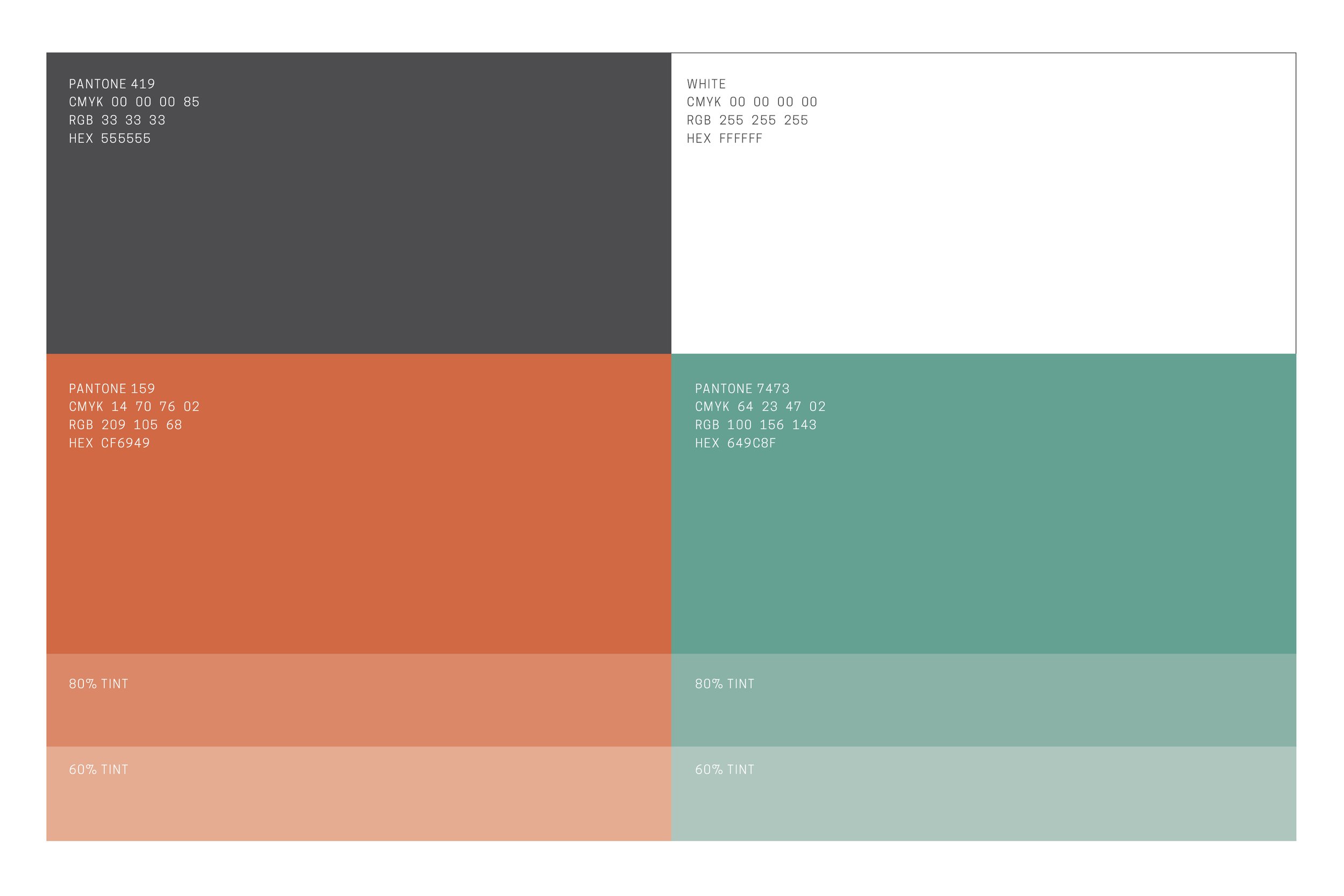
Evans’s use of color is immediately striking upon looking at his photographs. A selection of images were processed in Photoshop to render color mosaics.
A burnt orange and sea foam green were the predominate colors found in Evans’s photography. These were extracted to be used as the two primary colors of the visual identity.

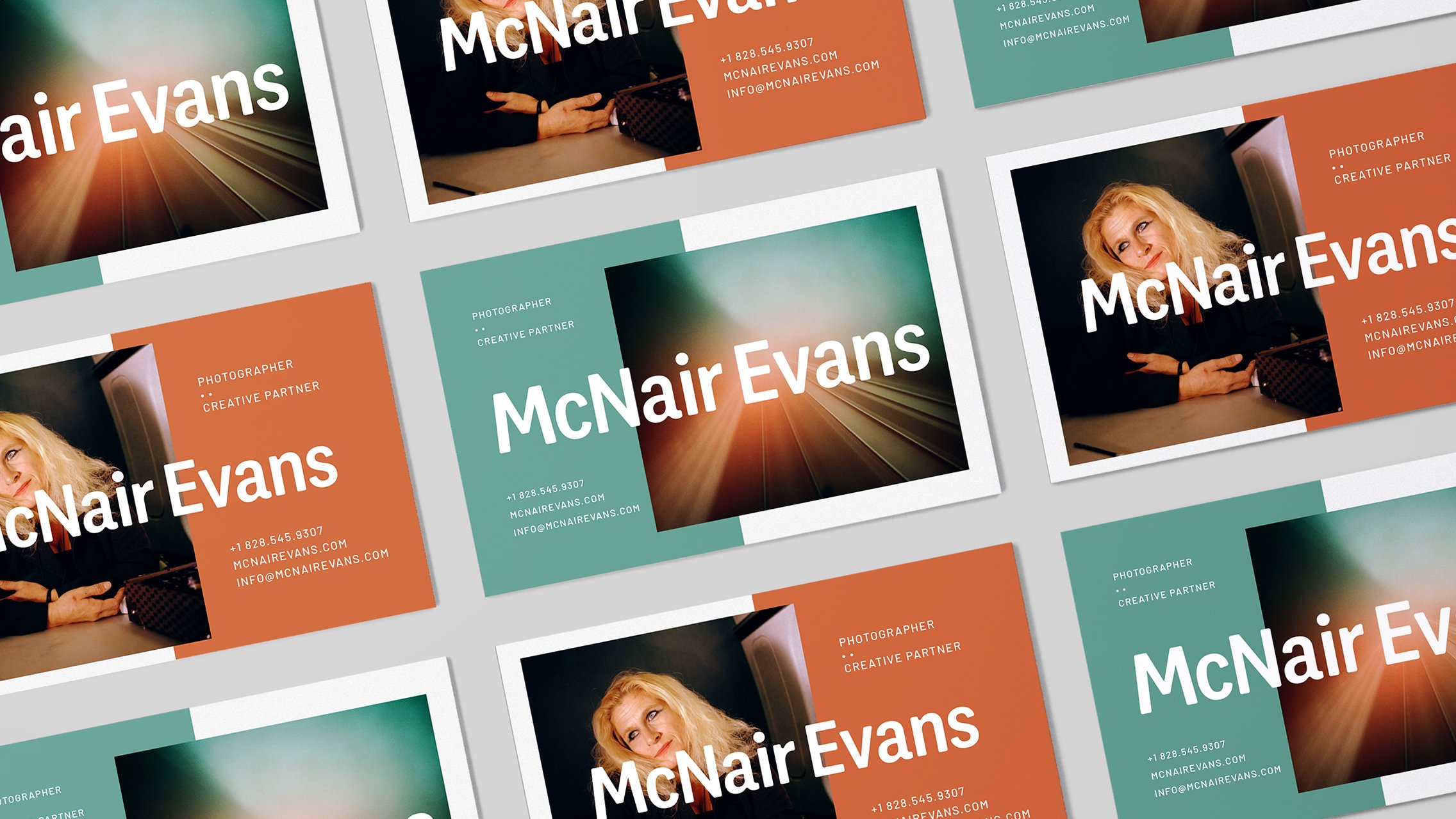
The primary design deliverable was a layout template that Evans could update as needed for exhibitions and self-promotional needs.
A color field is divided in half and is situated underneath a 1/3 and 2/3 division of space. The overlay of the two grids creates a structured composition that is dynamic, balanced, and adaptable.
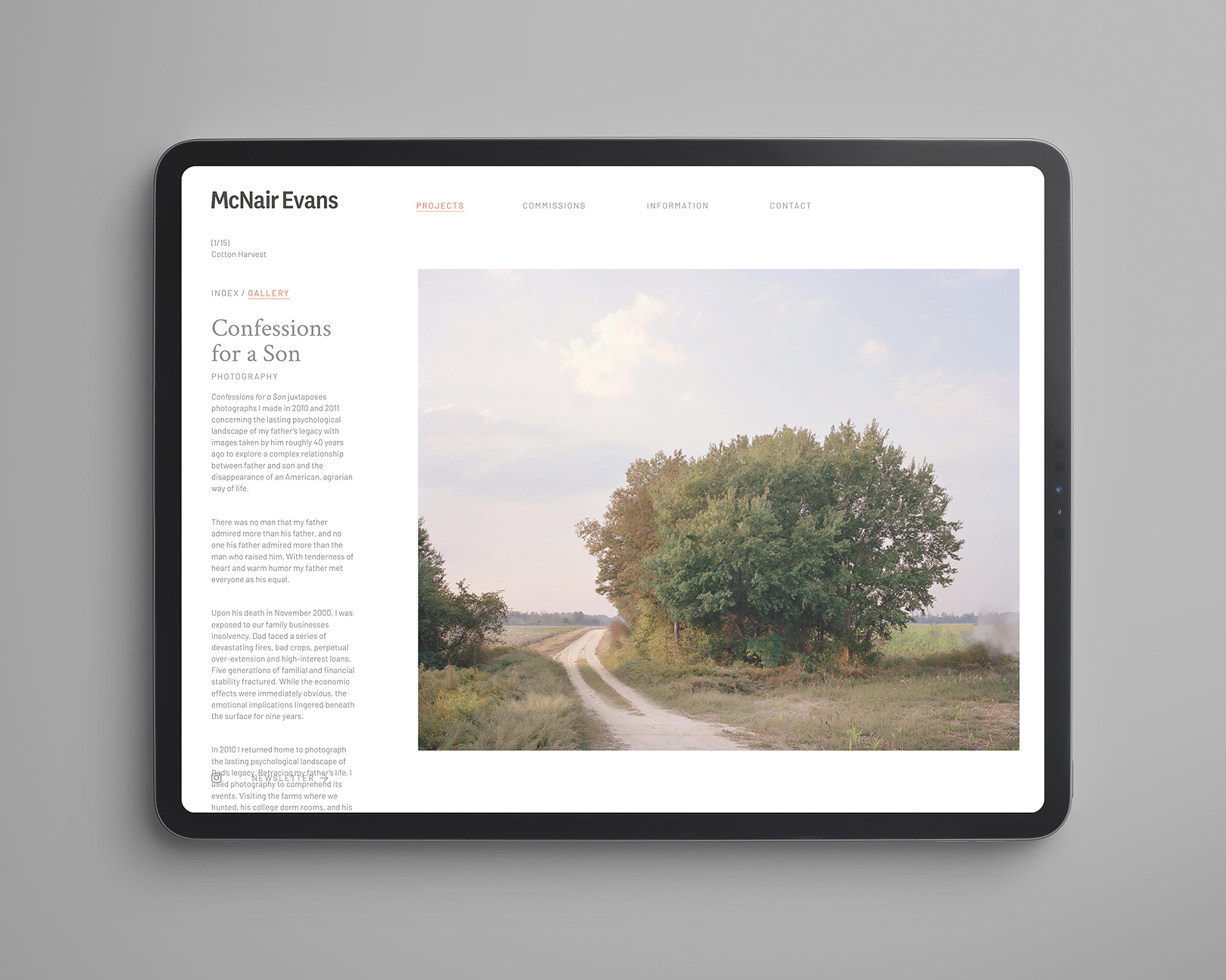
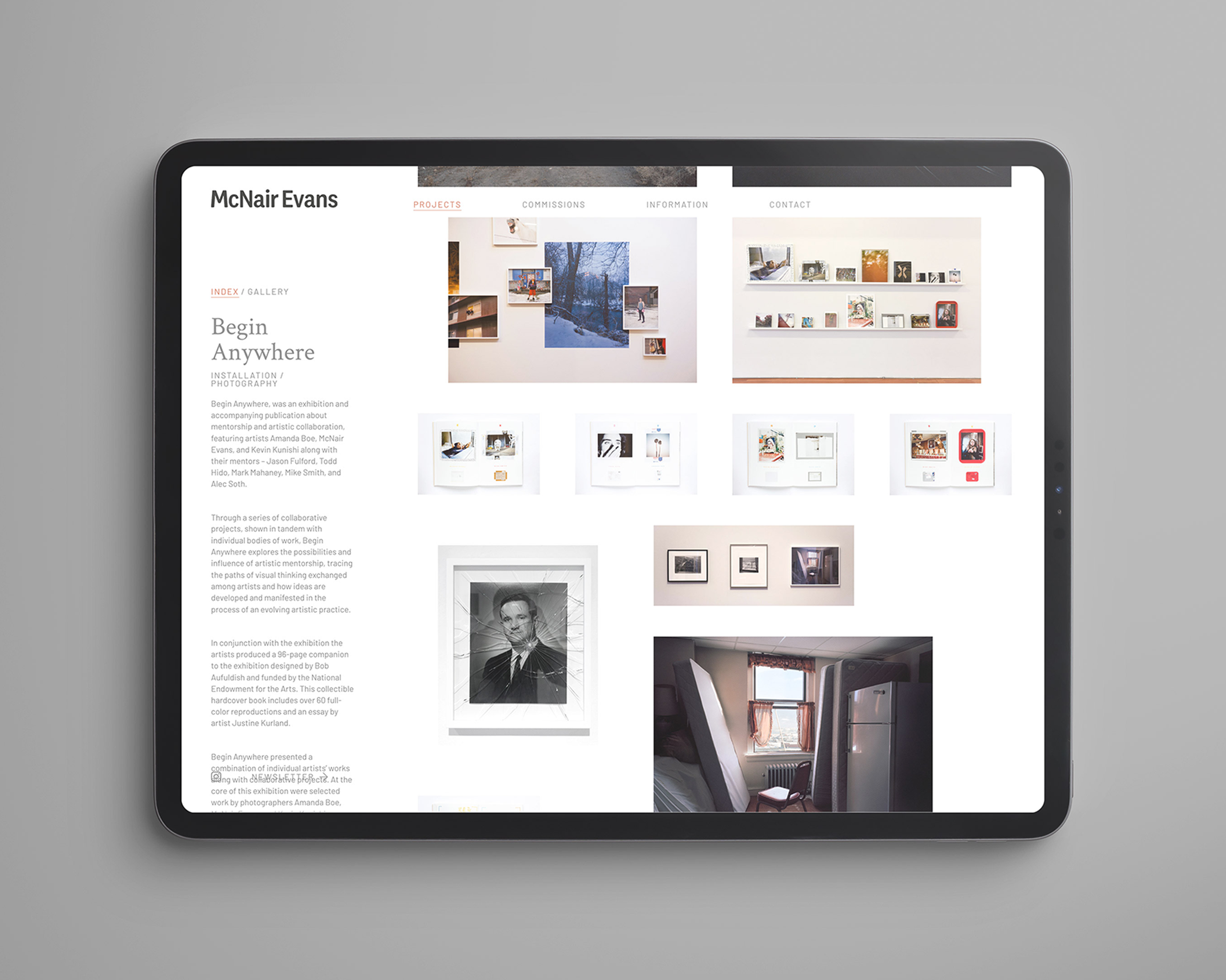
Color takes a more restrained role on the website in an effort to let the images themselves be the primary means of navigation. A masonry grid of photographs are randomly arranged on the home page to present the work as a single creative body. Individual projects can be selected and are presented in both thumbnail or slideshow viewing modes with the lefthand side bar used for all descriptive content. The isolation of text from image follows the traditional fine art presentation format.
Website development by Chris Gerringer.